amazing results
"Working with Amber is actual magic! She deep dives into your business’ essence and translates it into amazing marketing campaigns. She’s not just the best at what she does but also knows how to brighten your day as soon as she greets you!"
– Client: Mariana Treviño Guajardo, creative lead
success stats
Results for an Online Estate Planning Service
During the course of 6 months working together, my tests resulted in wins worth over $2M per year for this client!
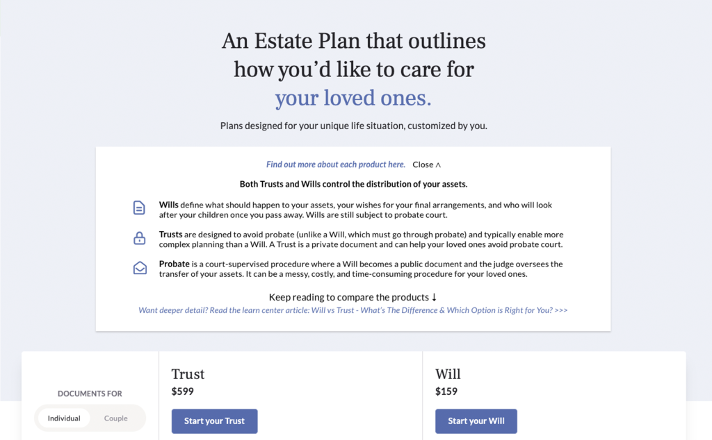
Worth $335,551 more in revenue per year!
My client had a product suite with many legal nuances and terms users did not fully understand. In order to help users better comprehend their product offerings and benefits, I created an informational expandable section. By offering users the extra information they needed to convert, my test variation won with a 46% lift in purchases. We are we are 93% positive that this lift is a direct result of the test variation. Should this value remain the same, implementing the new variation will result in $335,551 more in purchase revenue per year.
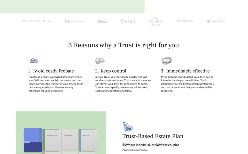
Worth $835,433 more in revenue per year!
My client’s premium product page was informational but dry. In order to increase desire, I added three benefits blurbs at the top of the page. This extra sales copy was a win for users – the test variation saw a 28% lift in conversions. We are 94% positive that this lift is a direct result of the test variation. Should this value remain the same, implementing the new variation will result in $835,433 more in purchase revenue per year. Extra bonus: I taught this client how to calculate test win values, empowering them to demonstrate CRO program ROI.
success stats
Results for an Online Simulation Product
Over the course of two years this Simulation company’s user base has grown by 68% with no marketing nor sales team changes beyond my CRO work. Major improvements included creating an all-new website for them. I personally performed all design, copywriting and dev work including a migration from Wix to WordPress. New conversion features include deeper product description copy and a heavy focus on social proof to build trust. Another big marketing win came when I redefined their email marketing strategy and created new templates that increased clickthrough rates by 355%!
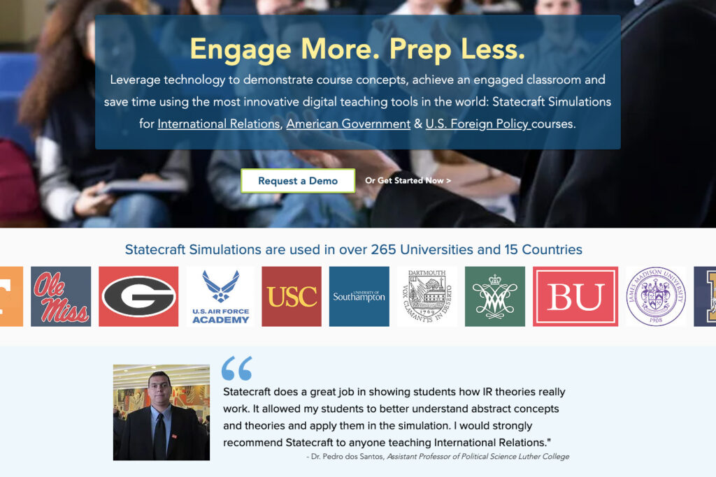
Through Voice of Customer Interviews I helped this Simulation company create a compelling value proposition plus reasons to believe. I updated the website messaging with this new selling copy and added credibility through a client logo carousel and testimonials. These simple changes resulted in 27% more clicks to their featured product page. Due to small traffic numbers final conversion purchase numbers were calculated manually with an estimated 25 to 45% more final purchases.
See testimonial below…
success stats
Results for a Mexican Fintech App
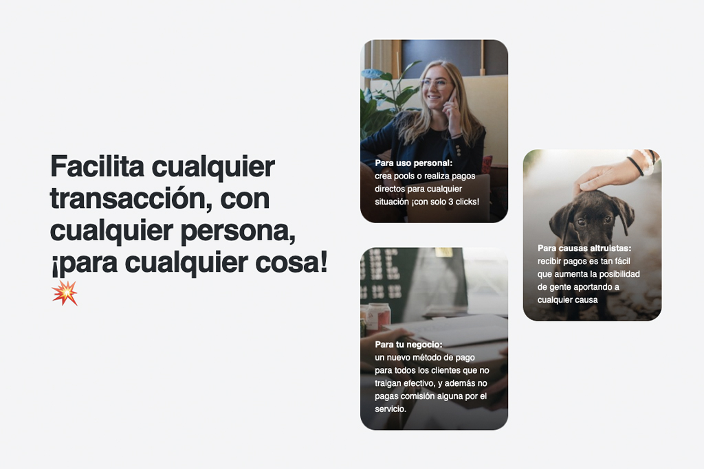
Using insights from user research, I worked with the client’s creative + dev teams to implement a suite of optimizations for their “About” app landing page. Improvements included adding a CTA button in the hero section, updating copy to reflect top product benefits and adding + elevating testimonials to create desire. The result was a 119% conversion rate increase at 91% confidence for the client’s most-desired performance metric: payments received.
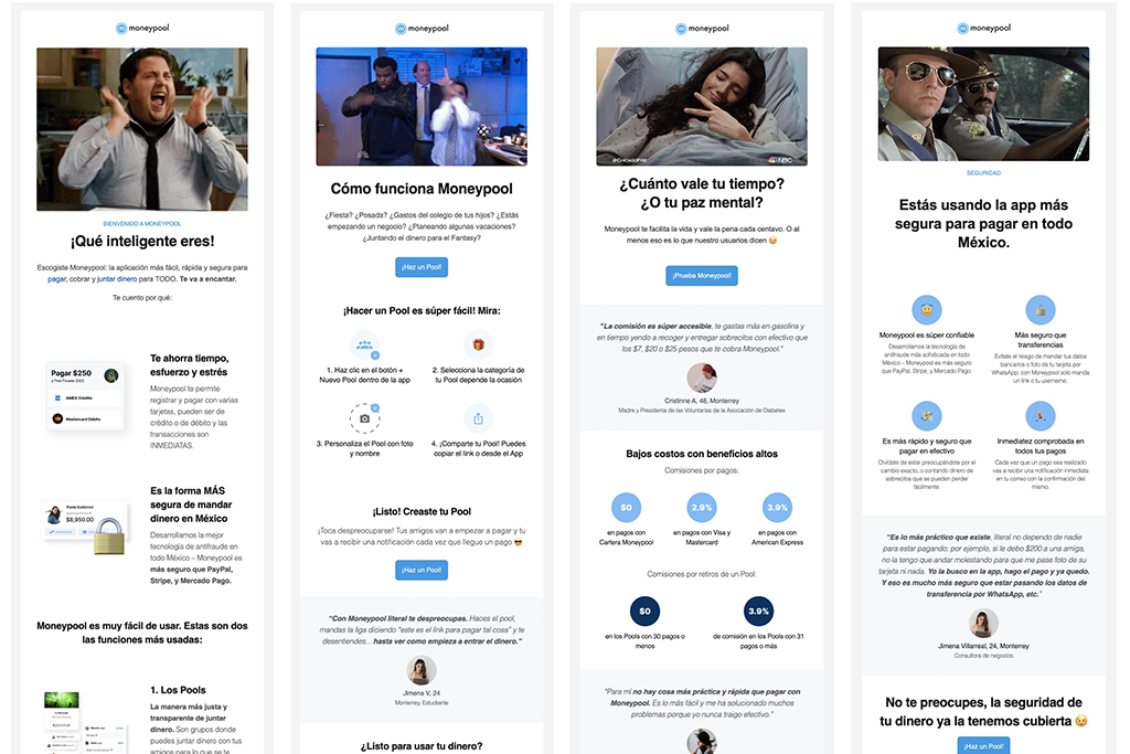
Client had an existing 3-email welcome series received when users first joined their app. After conducting user interviews to better understand customer motivation, I created a new messaging strategy including a strong value proposition + benefits statements. I tested the new messaging with a 4-email welcome series. The optimized email series outperformed the original with a 12% open rate increase and an impressive 177% clickthrough rate increase at 100% statistical significance.
success stats
Results for Education Lead Generation Clients
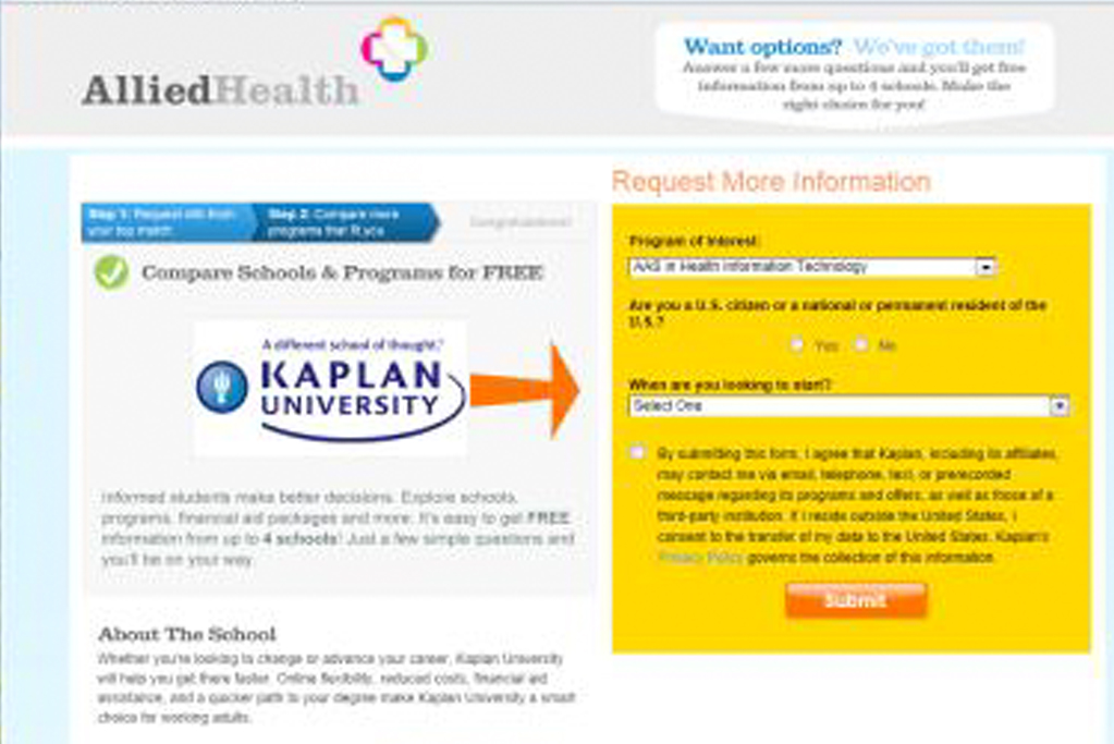
After a series of User Tests, I discovered users were confused by the length of a 4-step form flow. Adding progress indicators to the form pages to show users their location in the process increased conversion rates overall by 96% and revenue by 105%. There was a 233% improvement in users completing steps three to four. In a subsequent test I was able to increase CR by an additional 78% with design changes further enhancing clarity.
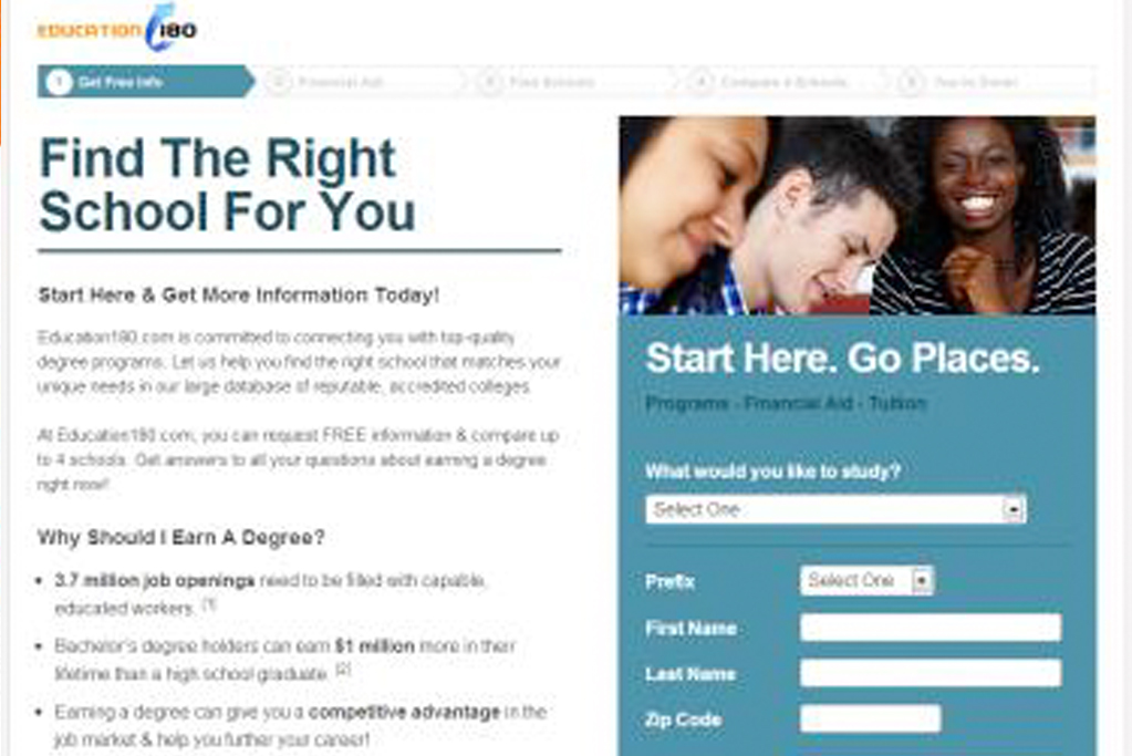
In a round of three subsequent tests I worked with the creative team to optimize a full-funnel 5-step landing page flow. The perfect combo of friendly color scheme, UX improvements and the right amount of copy including relevant benefit statements increased the page performance by 95%! In one of the tests we saw a 32% increase in CR by adding a relevant CTA link that offering users more information at the correct point in the journey.
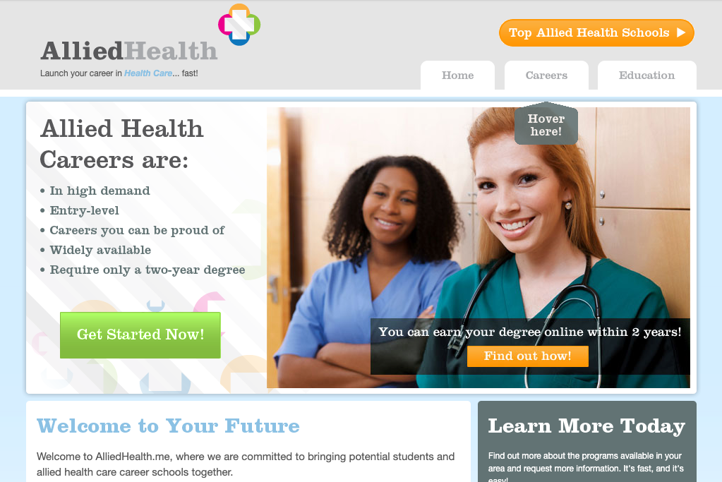
After a year of optimization and over 30 tests, top landing pages converted 200% better and the company’s paid media campaign profitability more than doubled. These conversion boosts allowed the media team to bid on new keywords and exponentially expand marketing efforts.
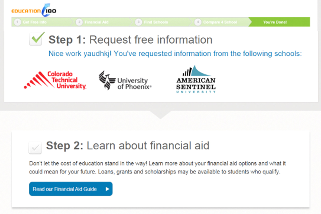
As part of a full-funnel optimization project I added a new geo-targeted upsell offer to a “request info” thank-you page . The additional offer created a new conversion opportunity + increased leads to small under-served local campuses. The page generated six times more organic leads for the site; a $1.10 increase in revenue per user that translated to $10k in new revenue per month.

Want to work together? Let's talk >
success stats
Results for an Experiential Gifting Company
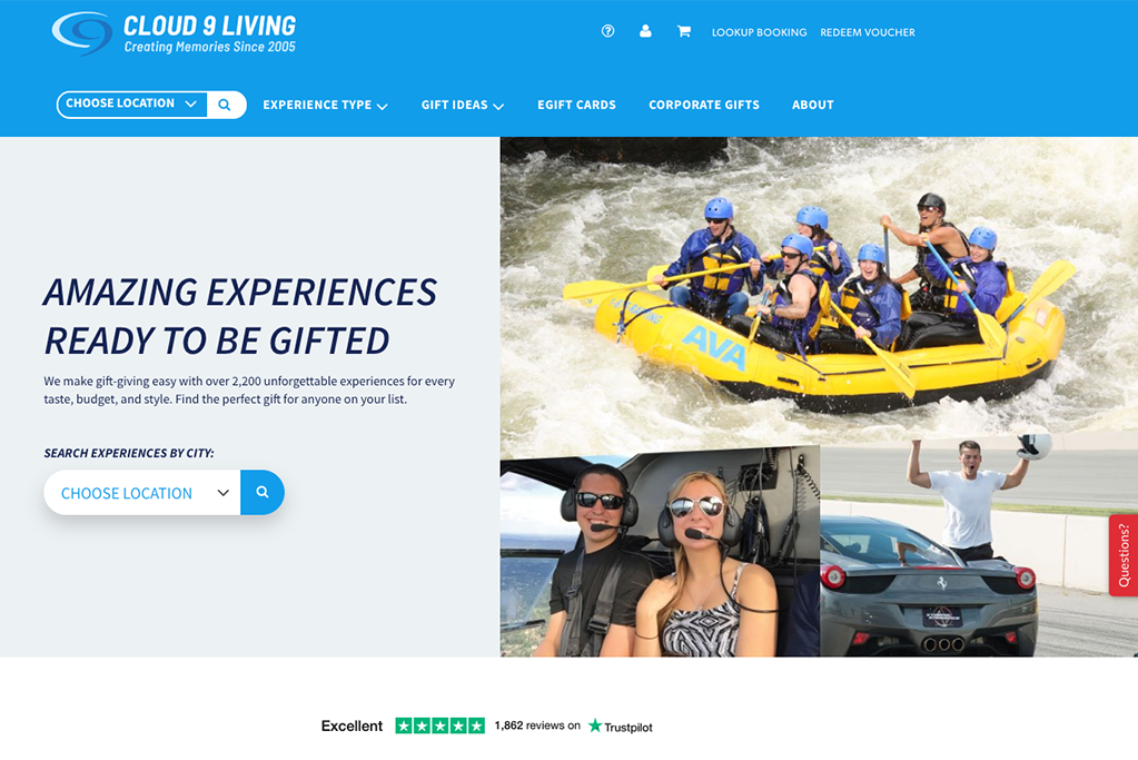
In partnership with the agency Digital Decoder, we ran nine tests for this Experiential Gifting client over the course of a year ranging from full site section re-designs to messaging tweaks. During that time we rolled out six successful optimization wins to their mobile site + six successful improvements to the desktop site. Their year-end result was a 13% increase in company revenue and a 38% increase in Return on Investment (ROI) for their advertising spend compared to the previous year!
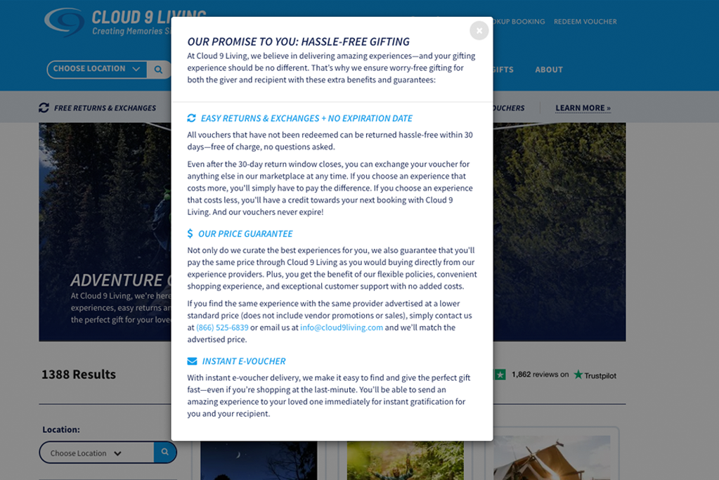
Voice of Customer Interviews + User Testing revealed that this client’s return and exchange policies were a major component of their value proposition. However, users were largely unaware of the policies. By making them more prominent, available in multiple places on the site and explaining them in more detail we increased the conversion rate for the entire website by 13% and revenue per visitor by 20%.

success stats
University Website
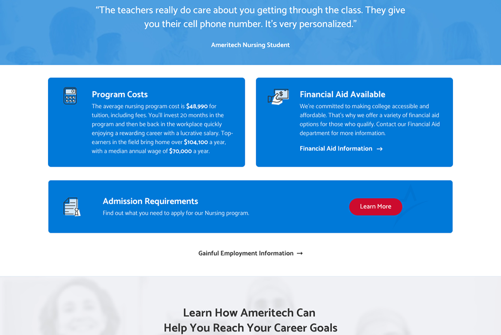
Voice of Customer Interviews + User Testing revealed students were searching for program pricing when doing College research. Adding tuition information increased conversion rates for “request information” leads by an average of 26% across four program pages. On the Nursing Program page, the client’s largest campaign, conversion rate increased by 39% at 99% confidence.
Water Park Website
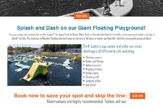
A conversion audit and heatmap analysis of this Water Park website revealed performance inhibitors such as a fuzzy value proposition, lack of clarity, competing CTAs and confusing information hierarchy. I simplified CTAs and rewrote headlines plus description copy to reduce confusion. In order to increase desire I added photos and urgency messaging. As a result, this client now has 33% more add to cart clicks and 26% more ticket purchases on their booking pages.
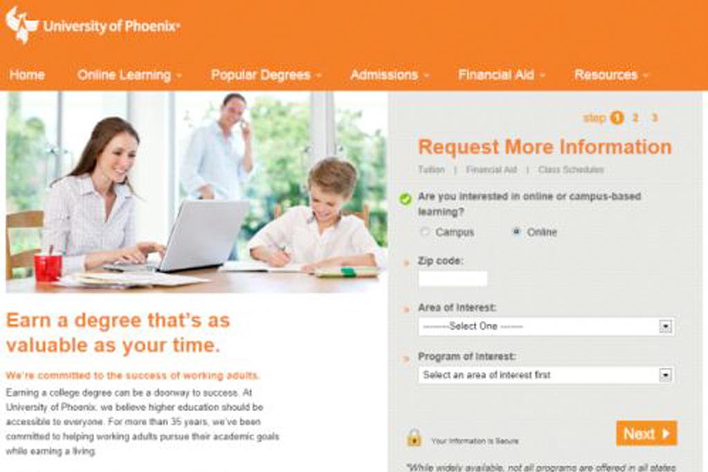
Voice of Customer Interviews + User Testing revealed students were searching for program pricing when doing College research. Adding tuition information increased conversion rates for “request information” leads by an average of 26% across four program pages. On the Nursing Program page, the client’s largest campaign, conversion rate increased by 39% at 99% confidence.

In order to better serve a user base of middle-aged females I increased the font size on the page for nearly all elements: from navigation to body copy. The result was a 30% improvement in Conversion Rate, 33% more revenue for the campaign and increased user engagement.

